02 / 07

Real Food Real Stories

  • Template Design
  • Design Guideline
  • Illustration

The Project

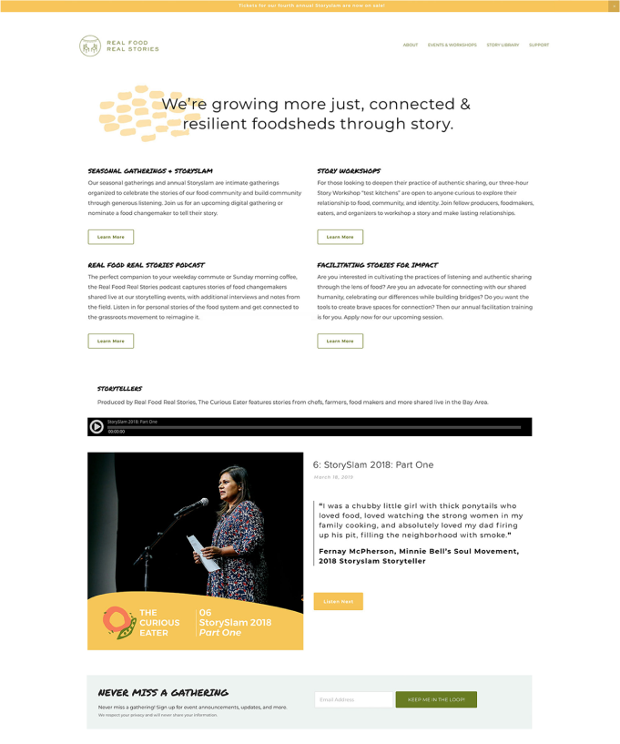
Real Food Real Stories is a non-profit organization that 
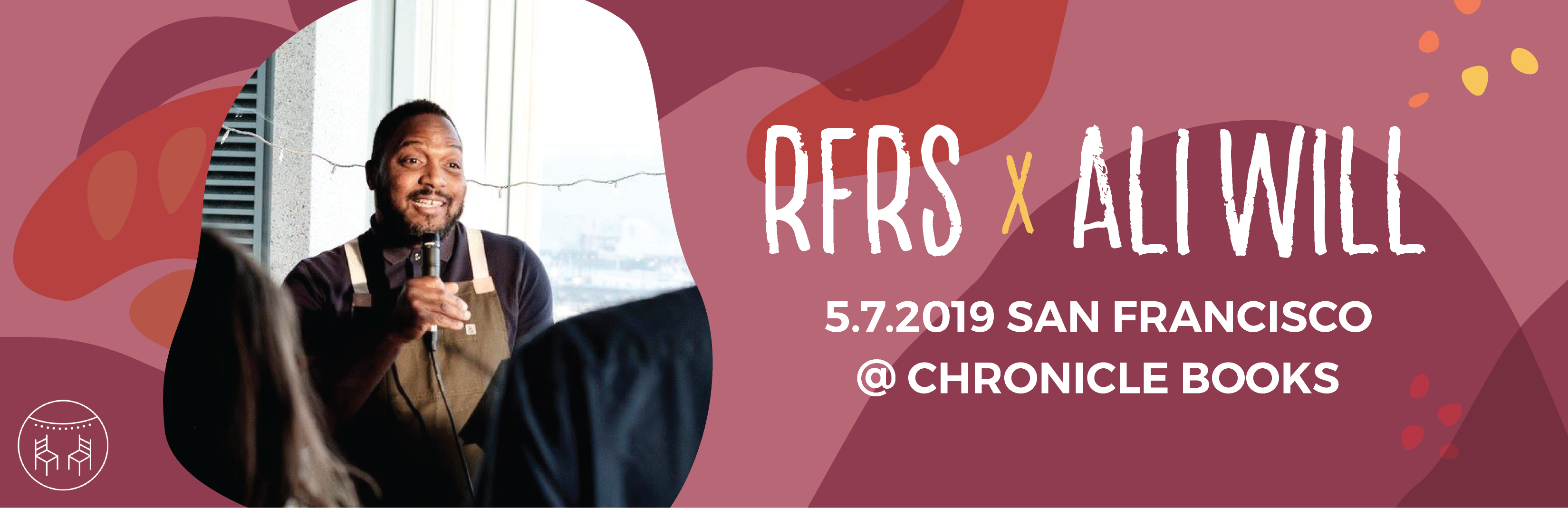
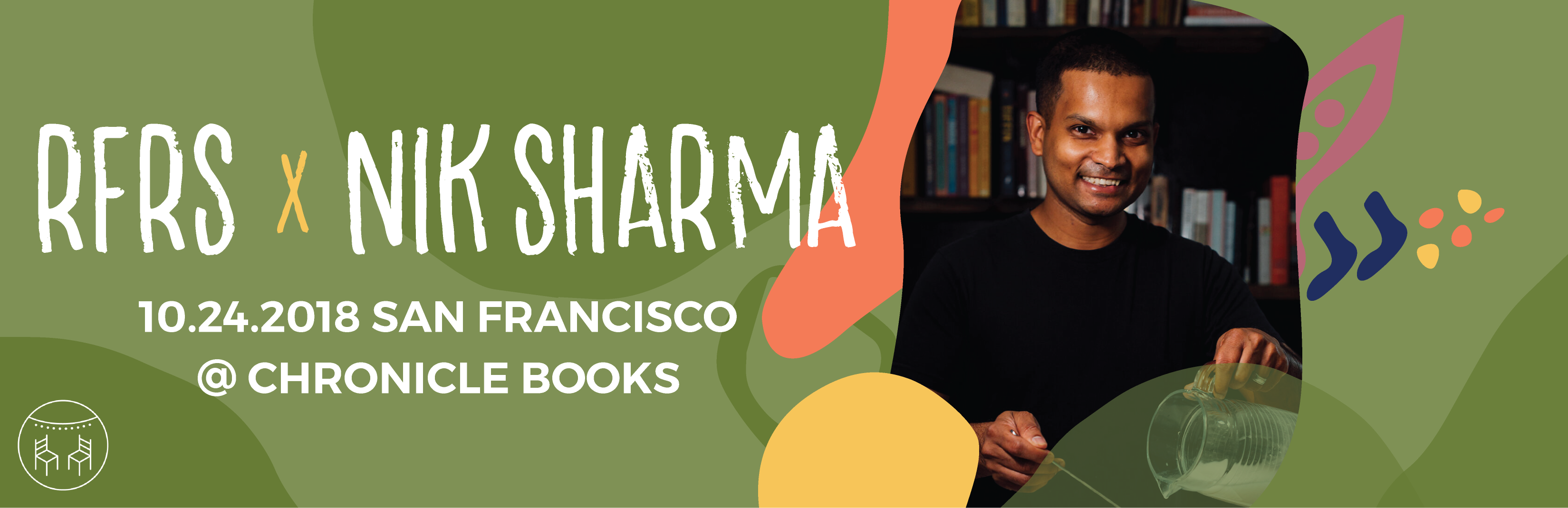
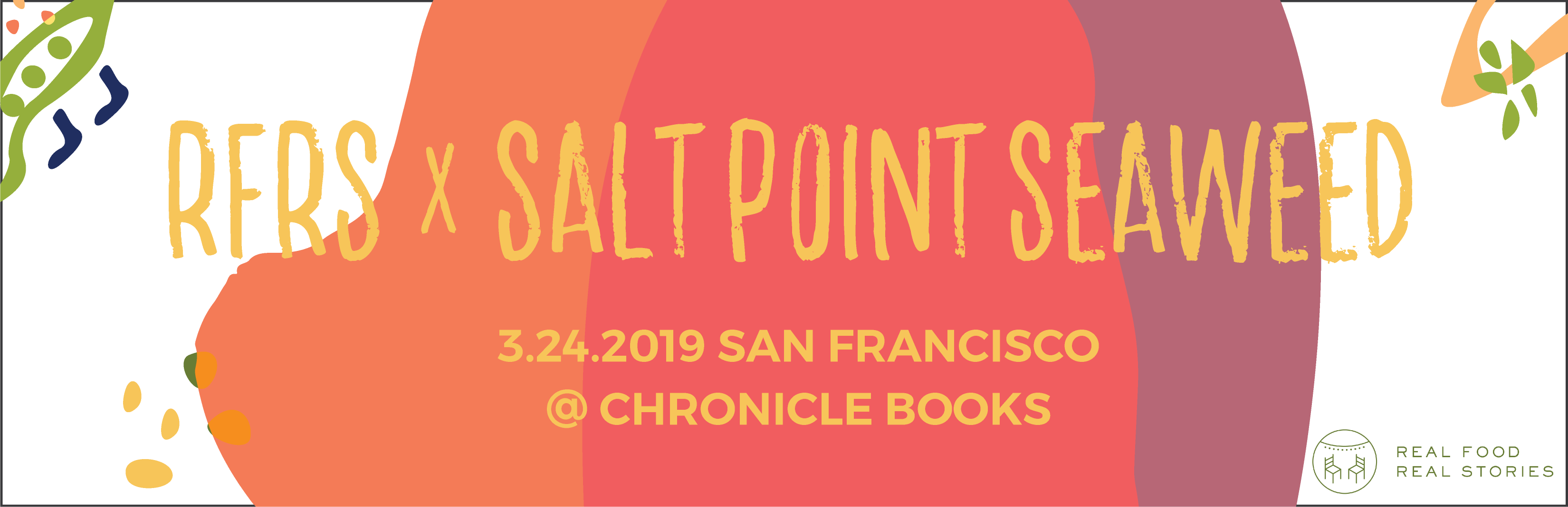
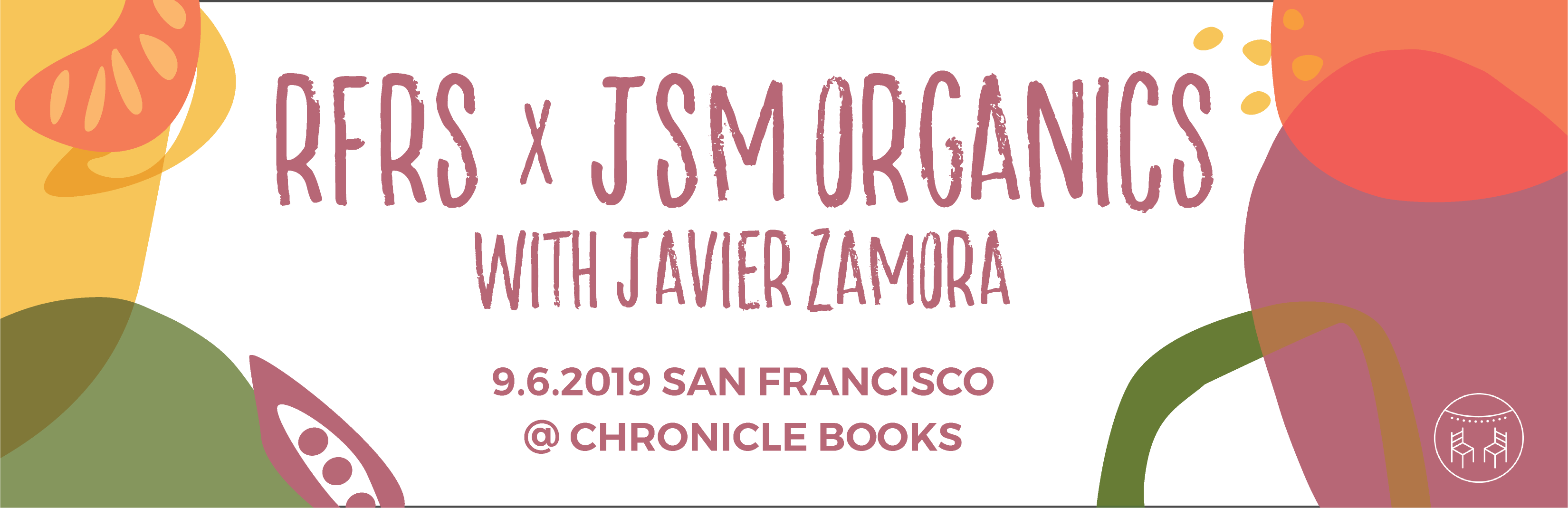
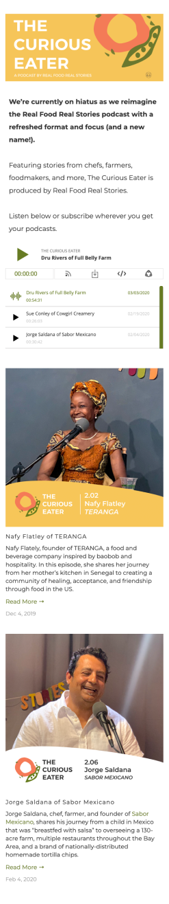
provides podcast captures of stories of food changemakers shared live at our storytelling events, with additional interviews and notes from the field. 
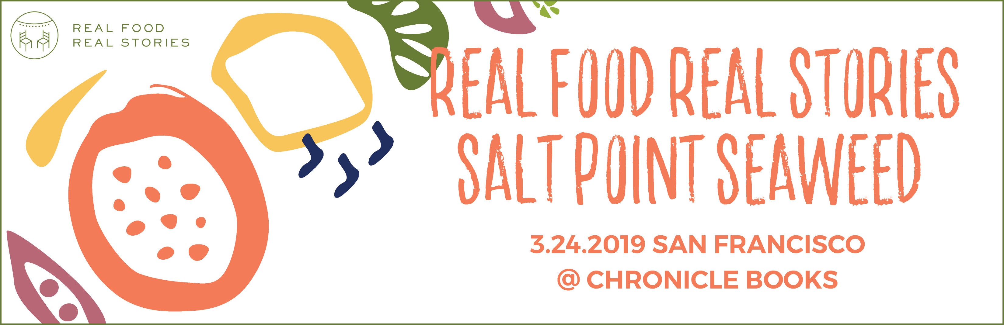
Adding personality and making visual stories make the brand powerful.

My Role

I volunteered to participate in a design marathon for the institution. We have to make sure to work closely with clients and get feedback and insights for the evolution. 
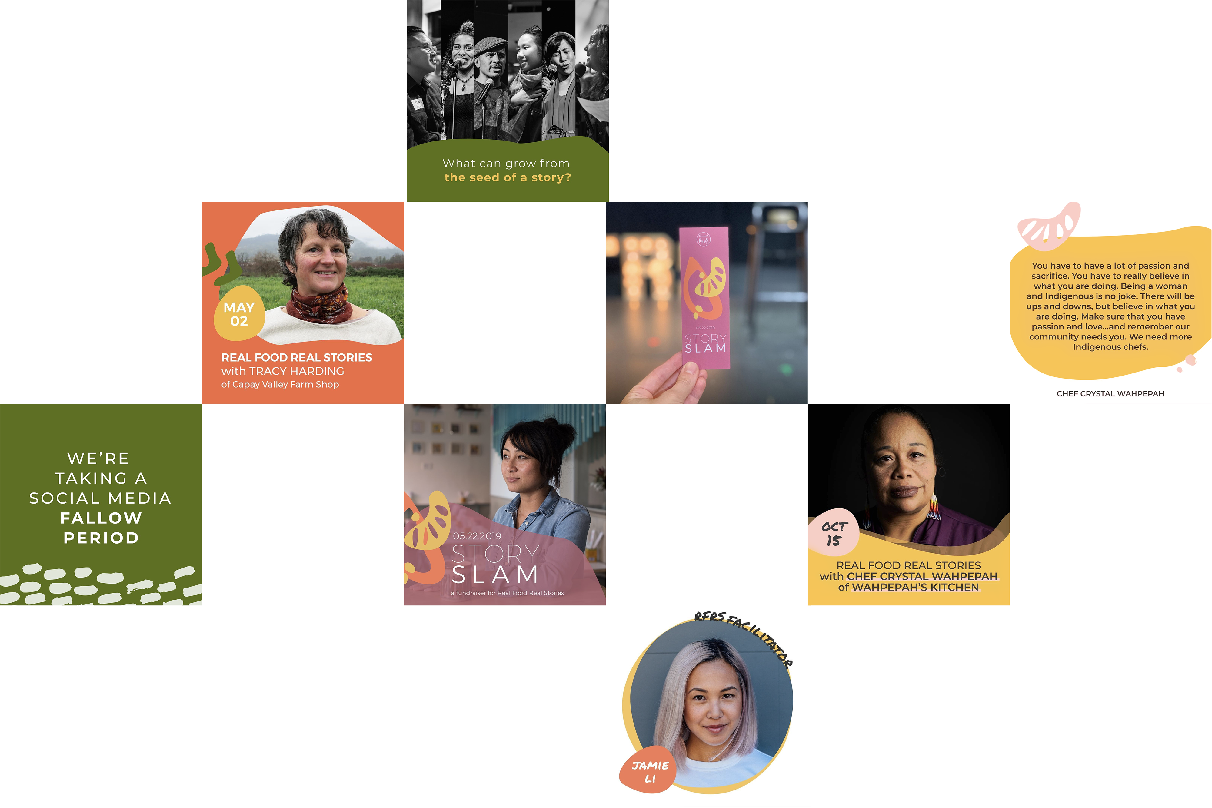
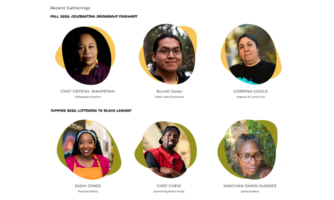
We created a design template based on a reference for all the digital platforms in the future. I worked with a team, brainstormed, designed illustrations, and updated cohesive design templates aligned with the previous design style based on their vision.
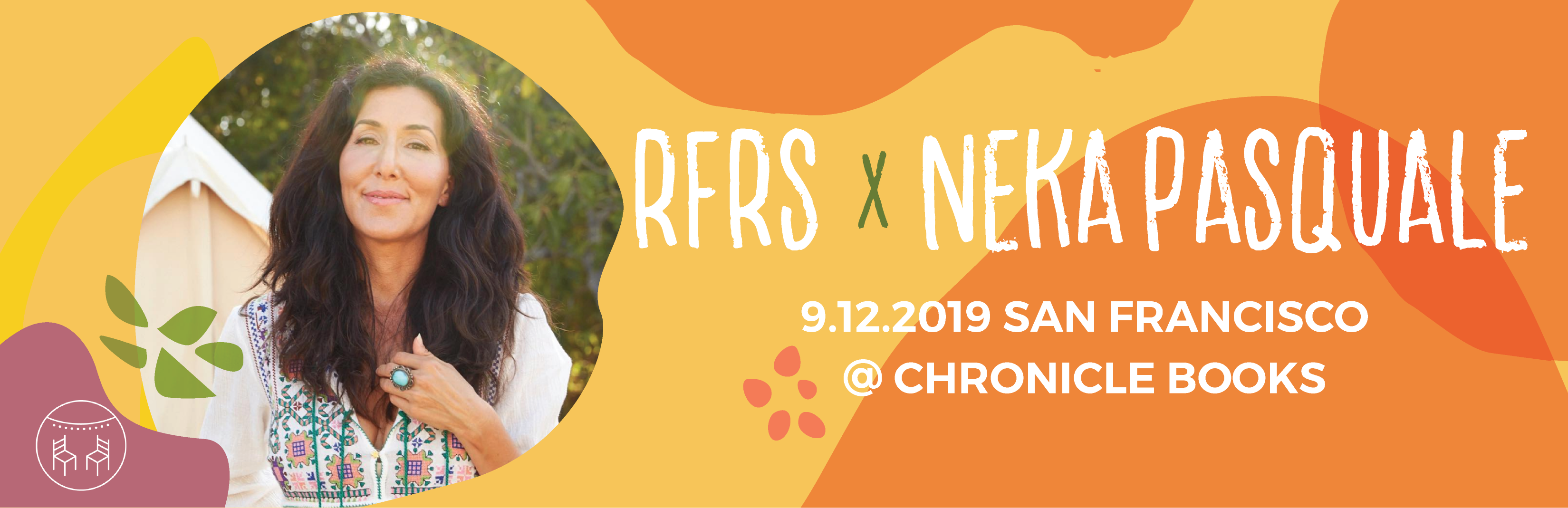
We create designs that are welcoming, exuding a happy energy and down-to-earth feel. At each stage, we take into account the goals and users to establish a precise visual system encompassing typography, color, and composition. By establishing systematic guidelines, we provide long-term advantages for the brand's success.
branding
Playwith
yourFood
colorfontillustration
Kale
Cantaloupe
Mango
Beet
Mint
We're demoncratizing food culture to feed our collective transformation. {Montserrat}

LIVE STORYTELLING EVENTS {Permanent Marker}

template design

Web Promotion

{A Systematic Brand}
We took the powerful and playful brand identity and created a platform that is as colorful and dynamic as the food and social brand itself.

{For A Good Cause}
When developing the visual elements for the brand, it was crucial to ensure that they reflected its core values. The brand revolves around communities and the people who are democratizing food culture.
Strong Stories To Share

{Strategy}
The client wants marketing templates that emphasize elements of intimate and friendly emotion. I ensured RFRS's voice was warm and genuine and reflected the idea that sharing stories was empathic.

{Result}
Our content strategy called for storytelling and editorial content to enable to raise the volume of bolstered support. This makes it possible to visually emphasize certain elements within a message while at the same time maintaining the brand's recognisability.

Social media
adaptation

Guideline The Templates

{Socials}
During the guideline phase of the project, we based our core design language around the cheerful tone that the client wanted to carry in their brand while ensuring that the overall purpose and the mission wasn't lost along the way.

{Stay Consistent}
The socials create cohesion with an emotion of trust and messaging that educates communities.

website

adaptation

Collaborated With The Web Design

{Goal}
We developed an organic, component-based design template as a library for future reference. They can access rules for the ready-made design elements and provide guidelines for photography and illustrations.

{Welcoming To Everyone}
The web experience has the same cohesive look and feel. We've created a template that easily adapts to different screen sizes. This was done to help the team save time.